← Back To Blog
Real Time Performance Monitoring: A Practical Guide

Your agency sent a strong batch of Upwork proposals on Monday. By Friday, the team is wondering why conversations feel quiet, but nobody can say when the slowdown began. The dashboard shows activity, the spreadsheet has been updated, and the month-end report will eventually confirm the problem. By then, a weak reply rate, delayed follow-up, or broken automation may have already cost valuable opportunities.
Real time performance monitoring closes that gap. It watches activity as it happens, detects meaningful deviations, and gives people enough context to respond while the problem remains fixable. For an agency, that means connecting technical signals such as latency and throughput with commercial signals such as proposal volume, reply speed, and proposal-to-call conversion.
Why Real Time Visibility Changes Everything
An agency owner usually notices an outreach problem through symptoms. A bidder says the workflow feels slow. A salesperson reports that replies have dried up. A review of the inbox reveals unanswered client messages, while the proposal log shows that fewer applications were submitted than expected. The team may have been operating below capacity for days without a clear warning.
Periodic reporting explains what already happened. It might show that last week's proposal count was low or that conversations produced fewer calls than usual. That information matters, but it doesn't tell the owner when the decline started, which part of the workflow caused it, or whether the issue is still active.
Real time visibility changes the response window. Instead of discovering a stalled workflow during a weekly review, the agency can watch proposal throughput, reply latency, and conversion signals while the team is working. A sudden fall in proposal activity might point to a search or automation issue. Slower replies might indicate an overloaded inbox, a routing problem, or a process that needs attention.
The cost of finding out late
Consider a simple outreach chain. A suitable Upwork job appears, the team identifies it, a proposal is prepared, the proposal is submitted, the client replies, and someone follows up. Every stage can perform well independently while the overall pipeline fails. If the proposal is submitted but the reply isn't routed to the right person, the agency sees activity without seeing progress.
The same logic applies to software. A server can show acceptable CPU usage while an application becomes slow for users. A dashboard may contain all the relevant metrics, but if no one checks it until the end of the day, the data isn't functioning as an active warning system.
Practical rule: Monitor the delay between a performance change and the moment a person can act on it.
This guide connects traditional real time performance monitoring with the KPIs agencies manage. You'll learn how to define useful metrics, design a low-overhead data pipeline, avoid alert fatigue, and apply the model to Upwork outreach. By the end, you'll have a practical monitoring habit for catching pipeline problems while they're still recoverable.
What Real Time Performance Monitoring Actually Means
Think of a monthly health report as a visit to a doctor. The report can identify a pattern, but it can't react to a problem that appears after the appointment. A wearable device works differently. It continuously collects readings, processes them, and can issue an alert when a measurement changes.
That distinction explains real time performance monitoring. A genuine system has three connected parts:
- Continuous collection gathers events and measurements as the system operates.
- Live processing evaluates incoming information against rules, baselines, or patterns.
- Immediate alerting sends a notification when a condition deserves attention.
A dashboard that refreshes occasionally isn't automatically real time monitoring. If an agency opens a report once a week and sees that reply rates declined, it has historical reporting. If the system detects an unusual decline during the workday and routes a useful alert to the person responsible, it has a monitoring workflow.
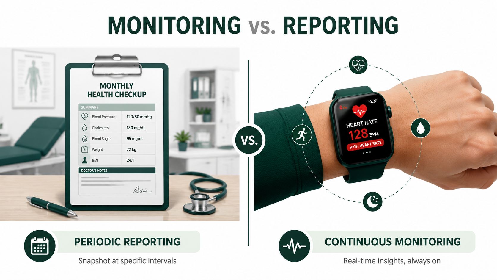
The difference between live and near-time data
Near-time reporting can still be valuable. A report generated regularly may help an owner compare campaigns, review completed work, or plan staffing. The important question is whether the system is designed to notify someone without waiting for a scheduled inspection.
For Upwork outreach, a weekly report might reveal that proposals were sent but client replies took too long. A live workflow can identify the delay while conversations are still active. That changes the action from “adjust the process next week” to “route this reply now and investigate the delay today.”
How the capability became ordinary
Real time performance monitoring once belonged mostly to specialized observability environments. By the early 2010s, modern operating systems had made continuous, usage-based visibility familiar to everyday administrators and users. Windows 8's Task Manager added an App history tab that tracked CPU cycles and network bandwidth for installed applications. Its live Performance tab displayed graphs for CPU, memory, disk, network, and GPU utilization, moving system management beyond periodic checkups into a multi-resource view of behavior as documented in this history of Windows 8 Task Manager.
The lesson for agency owners is straightforward. Monitoring isn't just a screen full of numbers. It is a feedback loop that connects an observed change to a decision. If the system only stores data, it reports. If it evaluates data and prompts a timely response, it monitors.
Core Metrics and Alerting Strategy That Drive Action
A useful monitoring setup measures three layers at once. System health tells you whether the machinery is available. Application performance shows how the workflow behaves. Business impact tells you whether the machinery and workflow are producing the intended result.
Start with the technical layer. Common operational reference points include Time to First Byte under 200 ms, server latency under 100 ms, and an HTTP 5xx error rate under 0.1%. Sustained CPU usage above 80% and memory usage above 85% can also serve as alert triggers, provided the team understands what action each trigger should cause according to this real time monitoring guidance.

Measure what averages hide
Latency averages can make a workflow look healthy while a small group of requests experiences serious delays. Percentiles make that distribution visible:
- P50 represents the median request.
- P75 gives a view of what most users experience.
- P99 exposes the slowest 1% of requests.
One API monitoring guideline recommends alerting when P99 latency remains high for more than 5 minutes, rather than reacting to every brief spike as described in this API performance monitoring guidance. The duration matters because a short burst may resolve without human intervention, while sustained slowness indicates a condition someone should investigate.
The same thinking applies to outreach. A single late reply doesn't prove that the process is failing. A persistent increase in reply latency across active conversations deserves attention because it affects the chance of continuing the conversation at the right moment.
Connect metrics to decisions
Every alert should answer three questions:
- What changed? For example, proposal throughput dropped or P99 latency stayed high.
- Why does it matter? The change may delay client contact, reduce completed submissions, or indicate a service problem.
- Who acts next? Assign the alert to an owner instead of sending it to an unmonitored channel.
Don't add a metric just because a tool can collect it. If you need help evaluating options, use a practical resource to find the right monitoring tool and compare alerting, retention, integrations, and diagnostic context. For agencies, a performance dashboard example can also help translate raw measurements into a view that managers can use during the workday.
A mature setup may track dozens of signals, but the active alert set should stay focused. A CPU warning is useful when it leads to a capacity check, deployment review, or workload adjustment. A notification with no clear owner trains the team to ignore future warnings.
Building the Architecture and Data Pipeline
An agency owner opens Upwork and sees a familiar problem: proposals are being submitted, yet replies arrive late and follow-ups sit unanswered. A useful monitoring architecture traces that delay through the whole system, from event capture to the decision a person makes.
The pipeline works like a water system. Applications, browsers, outreach tools, and message systems are separate taps. Instrumentation measures the flow at each tap, ingestion carries readings to a shared channel, processing interprets them, storage preserves useful history, and visualization shows what needs attention.
Start at the source
Instrumentation adds measurement points. For a software service, those points may capture request duration, error events, resource usage, and throughput. In an Upwork workflow, they can record a suitable job being identified, a proposal being drafted, a proposal being submitted, a client reply arriving, and a follow-up being sent. Those events connect server-style performance metrics with proposal throughput, reply latency, and conversion.
Streaming ingestion moves events into the monitoring system as they occur. The ingestion layer should accept data from several sources without requiring every tool to write directly to the dashboard. That separation lets an agency add a job-search source or messaging tool without rebuilding the entire pipeline.

Process before you display
Processing turns raw events into signals that support action. It can calculate rates, compare current behavior with a baseline, group related events, and suppress alerts that fail a duration rule. Without that step, an agency might receive separate notifications for a delayed proposal, a missing reply, and an unchanged queue, even though one workflow issue caused all three symptoms.
Storage supplies the context an alert cannot. Rather than treating history as a separate dashboard feature, retain enough context to show whether a change is new, recurring, or tied to a specific outreach stage. An agency can then compare a sudden drop in proposal throughput with earlier successful periods, instead of reacting to one isolated event.
Design test: If an alert fires, can the recipient compare the current signal with recent successful behavior without opening several disconnected tools?
Visualization is the final stage, not the whole architecture. A useful dashboard shows status, trend, ownership, and the next action. Teams that need searchable procedures and historical context may explore a company brain for teams, especially when information sits across documents, conversations, and dashboards. Leaders evaluating event-driven decision systems can also review automated business intelligence for a broader view of turning incoming data into operational choices.
Keep the observer lightweight
Always-on monitoring can alter the behavior it measures if instrumentation consumes too many resources. A research example describes a monitor that stayed below 0.5% CPU overhead, detected baseline deviations in milliseconds, and kept throughput loss below 0.5% with latency impact below 0.1% in this research example.
Those figures are an engineering example, not a universal promise. The design goal is to collect enough information to connect CPU, latency, and outreach outcomes while keeping instrumentation, transport, processing, and storage costs low enough for continuous operation.
Applying Monitoring to Upwork Outreach Workflows
An outreach pipeline behaves like a production system. It has inputs, processing stages, delays, failures, and business outputs. The difference is that the most important failure may not appear as a server error. A search can run successfully while surfacing poor-fit jobs, proposals can submit successfully while reply latency grows, and messages can arrive while no one follows up.
Map the technical metrics to agency operations:
- Proposal throughput is the number of suitable proposals the team moves through the workflow over a defined period.
- Reply latency is the time between a client message and the agency's response.
- Conversion measures how often proposal activity produces the next commercial step, such as a call.
- Execution time measures how long each workflow stage takes, from job discovery to submission or from reply receipt to response.
Watch the workflow, not just the total
A month-end proposal count can hide a daily stall. Real time monitoring helps an owner see whether the problem began during discovery, drafting, submission, routing, or follow-up. The owner can then assign a specific investigation instead of asking the whole team to “improve outreach.”
A practical workflow might flag an unusual drop in proposal throughput, a growing queue of unanswered conversations, or a decline in proposal-to-call conversion. The alert shouldn't claim that every change is a crisis. It should point to a deviation that requires a human check, such as reviewing job fit, account activity, message routing, or recent process changes.
Use a time series instead of a snapshot
A single day's result can mislead an agency. Real time monitoring works better when it measures execution time, jitter, and throughput over an extended period. Collecting timing data before, during, and after execution lets teams calculate average execution rates, standard deviation, and maximum jitter to evaluate whether behavior remains steady as outlined in this benchmarking guidance.
For Upwork outreach, that means preserving event timestamps rather than recording only weekly totals. If proposals are submitted in bursts, replies arrive late, and calls fluctuate, the time series reveals the sequence. That sequence helps the agency distinguish a temporary change from a repeatable bottleneck.
Owners can use an Upwork data analytics workflow to organize those signals around decisions. The useful question isn't “How many numbers do we have?” It's “Which change should alter today's outreach behavior?”
Common Pitfalls and Why More Data Does Not Mean Better Monitoring
More telemetry can create less clarity. Teams often begin by collecting everything, then add thresholds whenever someone notices a problem. The result is a dashboard that looks advanced but sends alerts that nobody trusts.
Static thresholds create one major weakness. A fixed rule can detect a familiar violation, but it may miss a new anomaly that falls below the configured limit. In a fast-changing cloud environment, the same rule can also generate false alarms when normal operating conditions shift. Research discussing real time anomaly detection highlights this gap between collecting data quickly and deciding which deviation is actionable in this analysis of dynamic distributed systems.
Signs that monitoring is producing noise
Audit your setup for these warning signs:
- No owner: Alerts reach a shared channel, but nobody is responsible for the next action.
- No duration rule: Brief spikes page people even when the system recovers immediately.
- No context: The alert identifies a failed metric but doesn't show related events or recent history.
- No business connection: The team can see CPU or latency changes but can't explain their effect on proposals, replies, or calls.
- No suppression: Several alerts describe the same underlying incident as separate emergencies.
The correlation gap is just as serious as the threshold problem. An agency may collect job discovery events, proposal records, message timestamps, and booking data, yet fail to connect them quickly enough to explain a conversion decline. Technical teams face the same challenge across services and tools.
Audit the response path
Independent observability survey coverage published for 2025 found that 73% of organizations still lacked full-stack observability, while complexity and too many siloed tools were identified as leading barriers in this New Relic forecast. The statistic matters less as a benchmark than as a warning about fragmented visibility.
Ask four questions. Can the team trace an alert to a specific workflow? Can someone see the related history in one place? Does every critical notification have a named owner? After an incident, can the team change the baseline or rule so the same noise doesn't return?
If the answer is no, adding another dashboard probably won't help. Improve event naming, ownership, correlation, and response instructions first.
How Earlybird AI Embodies the Real-Time Monitoring Model
An agency can build its own outreach pipeline when it needs control over event schemas, storage windows, alert rules, and integrations. That route suits teams with the technical capacity to maintain ingestion, processing, storage, and alerting components.
Earlybird AI uses a managed approach. It brings Upwork search, proposal creation, client-message replies, follow-up activity, profile optimization, analytics, and multi-user workflows into one operating environment. The same monitoring model applies to its outreach data: proposal throughput shows how much work enters the pipeline, reply latency shows where conversations slow, and conversion shows whether activity produces commercial progress.
Visibility paired with action
Consider an Upwork proposal that receives no reply. Monitoring can flag the delayed response, while an automation system can route the event or prepare a follow-up step. Earlybird AI states that its workflow submits proposals within about 10 minutes of a job posting and sends replies in under 5 minutes. These timings describe the platform's intended workflow, not a guaranteed outcome for every account or client interaction.
Speed is only one part of the assessment. A dashboard shows that performance changed. An automation layer can reduce manual delay, while analytics help determine whether the action improved replies, conversations, or conversion. Agency owners should still review job fit, message quality, account activity, and the quality of resulting opportunities.
Live signals need historical context
A live counter is like a speedometer. It shows current movement, but historical records reveal whether the same campaign, bidder, or workflow has been slowing repeatedly. Oracle's documented model pairs live monitoring with retained history, including monitor history, screenshots, and HAR files kept for 90 days, with filtering across recent runs within that retention window in the documented monitoring model.
For outreach, the equivalent is immediate visibility into active proposals and replies alongside historical campaign performance, bidder activity, response behavior, and booked calls. That context helps an owner distinguish a temporary delay from a recurring process problem.
A managed platform may fit an agency that wants automation and analytics without assembling every pipeline component. Teams managing multiple bidders should also examine account safety, regional IP handling, human-like behavior, and password protection. Before deployment, confirm how the platform handles accounts, permissions, and workflows.
Earlybird AI provides automated job discovery, personalized proposals, replies, follow-ups, and analytics for Upwork outreach. Visit Earlybird AI to review how its automation and real time visibility can support faster responses and multi-bidder management.